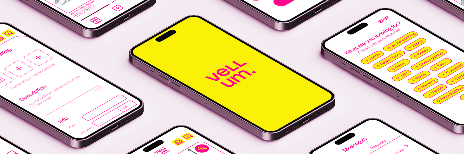

A common requirement among New York City Art and Design colleges is that the first year is dedicated to fine art fundamentals, regardless of their major. Students are required to either buy or pay extra for an assortment of paper, tools, and other materials, which is convenient, but they often go unused beyond this initial year.
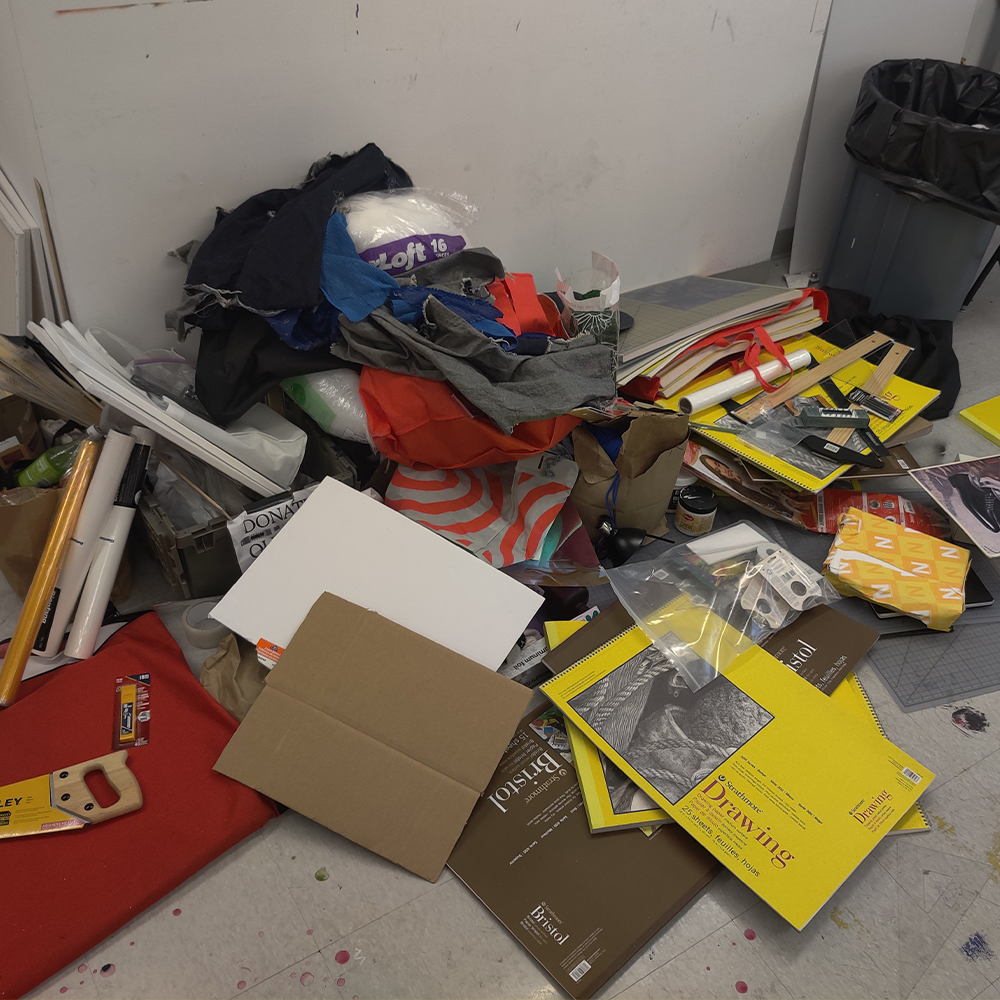
A stronger indicator of this was when the Instagram account @frugaliciousmamas took it upon themselves to try collecting all the Parsons first year kit leftovers from one of the dorms, and there was so many materials that they couldn't even transport the materials to the donating center they wanted to use.
Much of the art supplies they ended up collecting are still in @frugaliciousmamas's apartment, and it requires much communication in order to distribute all of them. Outside of this first year program, we have had first had experience with extra art supplies as well.
So we asked:
What can we do about the overwhelming amount of art supplies left each year?

After identifying our problem, we wanted to learn the scope of our issue by conducting surveys with many different art students.
We did this through Google Forms, and shared it in various online communities to get a diverse amount of input; Our questions came from a preliminary interview that we had with @frugaliciousmamas.
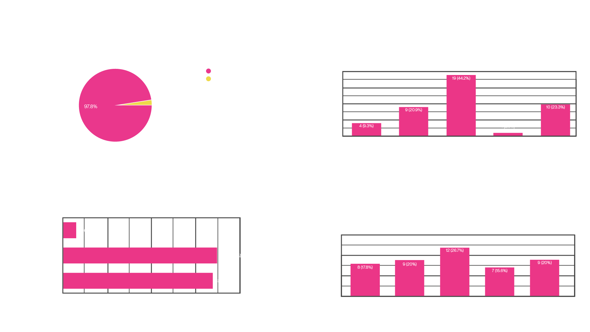
In total, there were 45 responses from 4 different NYC Art schools.
After our survey, we went into interviews to talk 1 on 1 with 7 students from different schools and
majors to better understand the NYC art student experience.
Through these interviews we learned that:
There is a lack of a centralized platform for NYC art students to easily buy, sell, or donate art supplies, resulting in inefficient disposal methods and wastage of reusable materials.
Creating a platform for students to trade, buy, and sell art supplies will reduce the amount of unused materials in students on and off-campus accommodations, thereby decreasing spatial congestion as measured by reduced storage space usage.
The Hypothesis statement guided our design choices to ensure that we attained the goals that we had initially set when embarking this case study:
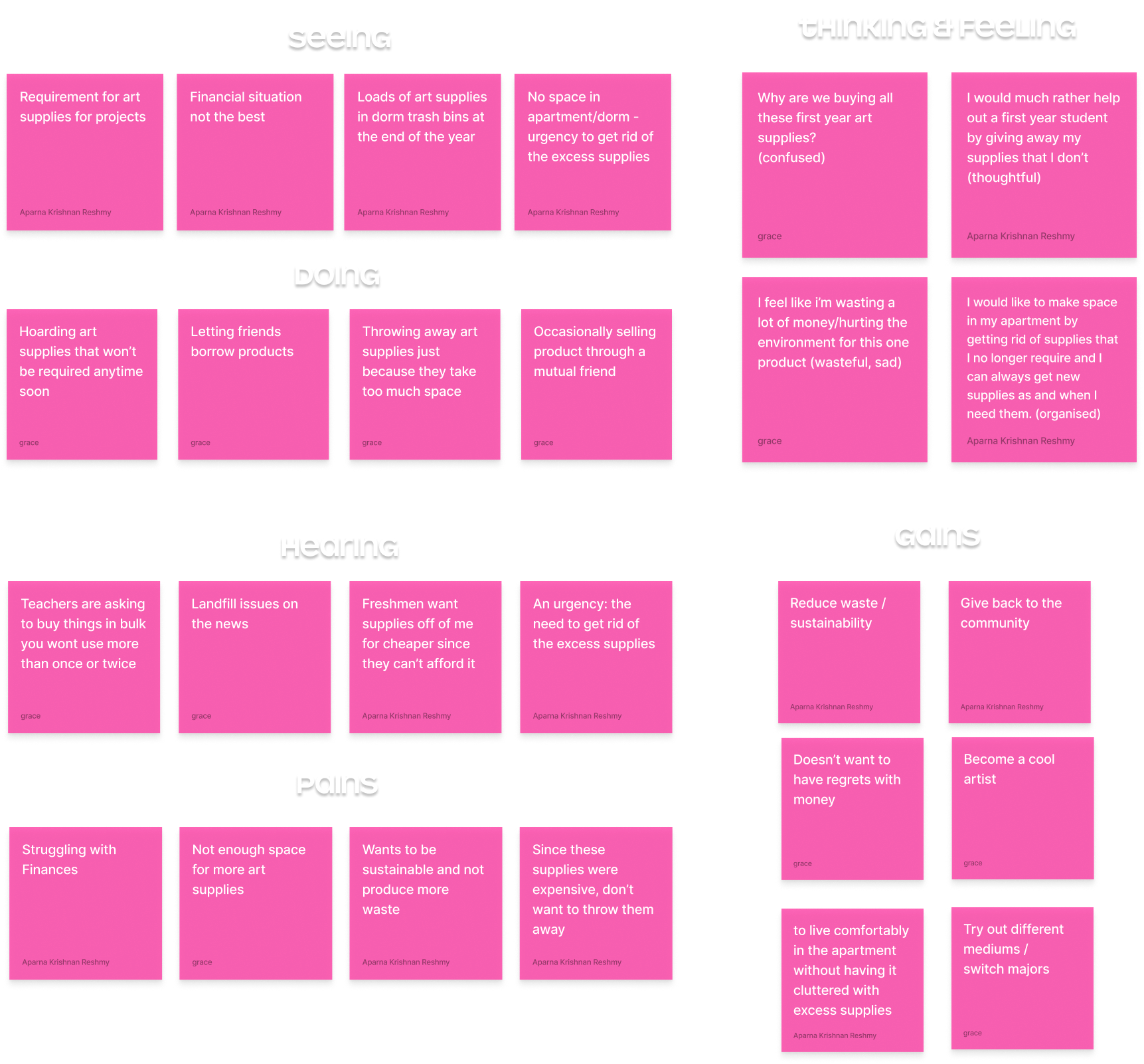
We synthesized our user research findings using an Empathy Map to identify common patterns and insights. This tool enabled us to align our design strategy with the users' experiences, capturing what they see, hear, do, think, and feel. It was instrumental in pinpointing pain points and opportunities for enhancing their experience as well as directing our user personas.
Based on our Empathy Mapping, surveys, and interviews, we were able to summarize our findings into three distinct user personas. Each persona embodies the collective goals, frustrations, and needs observed across our user base, providing a focused lens for our user research decisions.
We learned from our interviews that one of the primary issues is the first year kits, hence our main/primary user persona is that of a First Year Student (BUY persona).
The next would be the undergrad students who no longer require their existing supplies (SELL persona).
Additionally, we wanted to consider the alumni who would want to clear out their apartment but not want to throw away their supplies (DONATE persona).
All students wanted a sense of community as well as promoting sustainability within their student circles.
Our app seemed to have a lot of similarities with other apps, two main contenders being Facebook Marketplace and Depop.
To understand how we could differentiate our product and improve the current landscape, we chose to do a SWOT analysis of these contenders.
Our analysis concluded that enhancing user privacy and security is critical, addressing the deficiencies in existing apps' handling of sensitive information. Additionally, we will integrate a community-validated verification process to reinforce seller credibility and trust.
From our swot analysis this is the user flow that seems to be common- it’s hard to find a specific art supply, you may not be chosen to receive a product.
The main issues that we want to tackle are,
- Art supplies takes up space,
- Art supplies are expensive,
- It is unsustainable to buy art supplies, only to end up throwing them away.
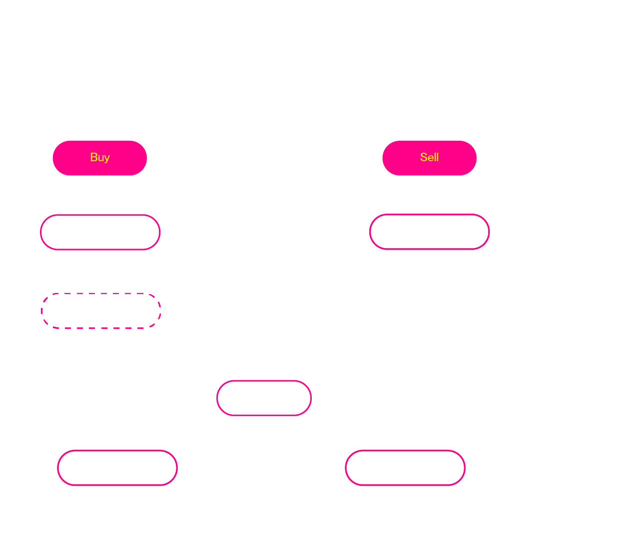
The data collected during the Competitive Analysis process was used to create detailed information architecture. As we were doing this, we felt that our information architecture was too detailed, so we looked back on our past takeaways.
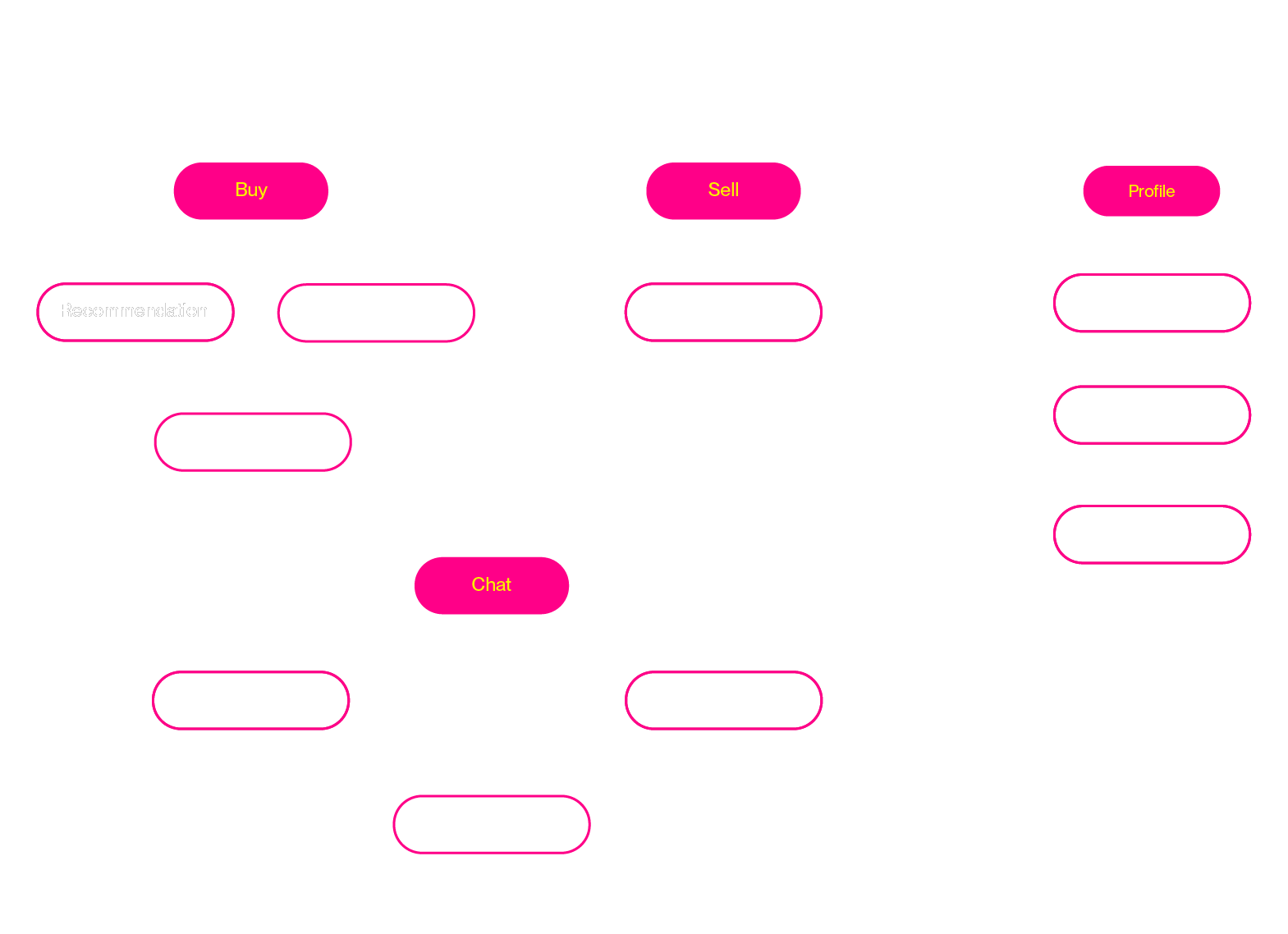
Our user personas represent a student who would primarily buy, another who sells, and another who wants community. By following these 3 flows, we created a cleaner base for our information architecture.
Finally, we integrated solutions for the current user flow and created our final information architecture here:
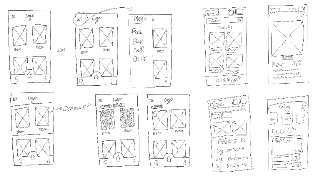
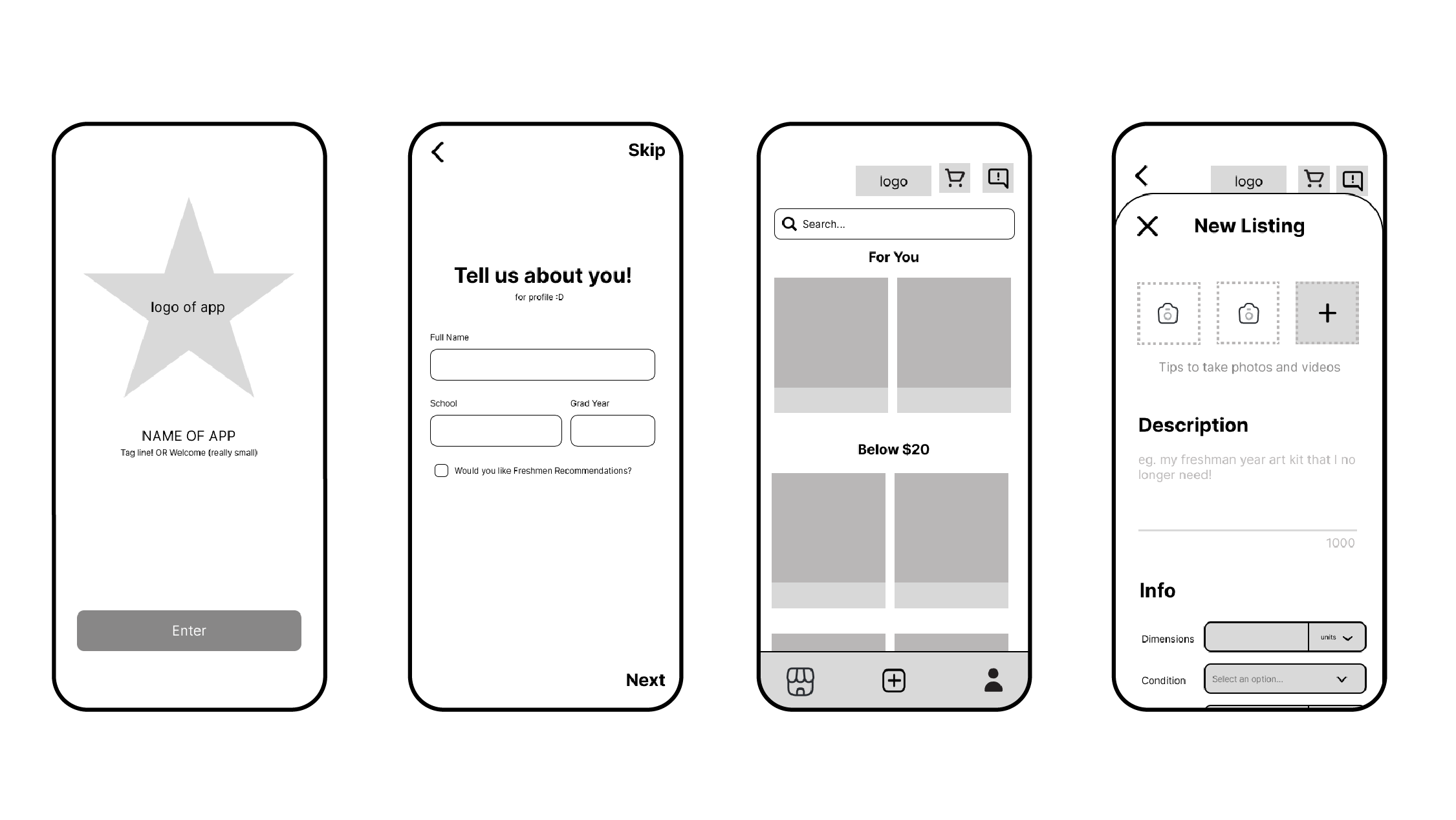
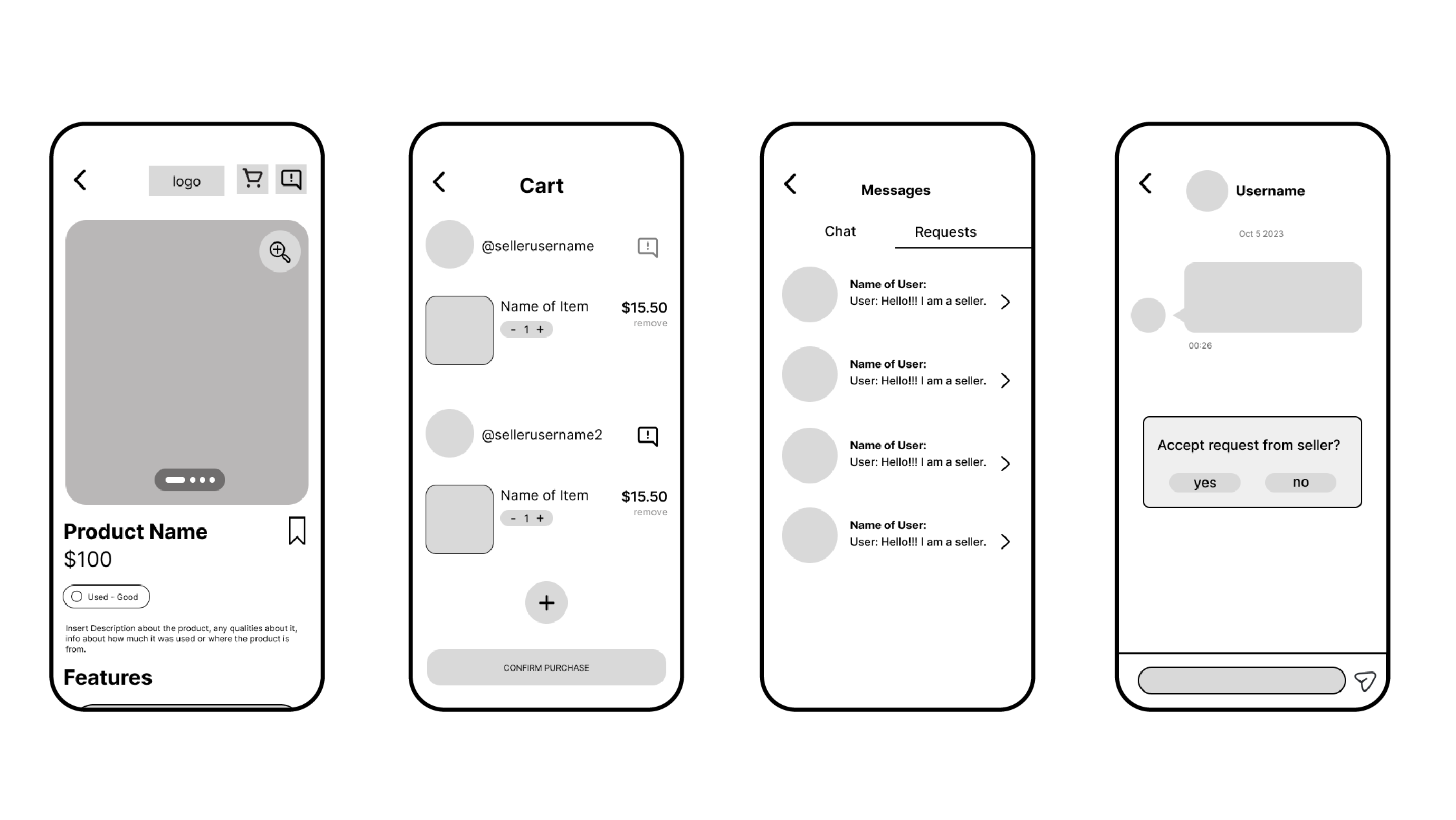
Now is where we began the fun part of bringing our research to life by designing! Starting off by simply sketching our ideas, to then moving onto Figma for wireframing. Much of our initial layouts for the wireframes were inspired by user flows from our competitors' applications.
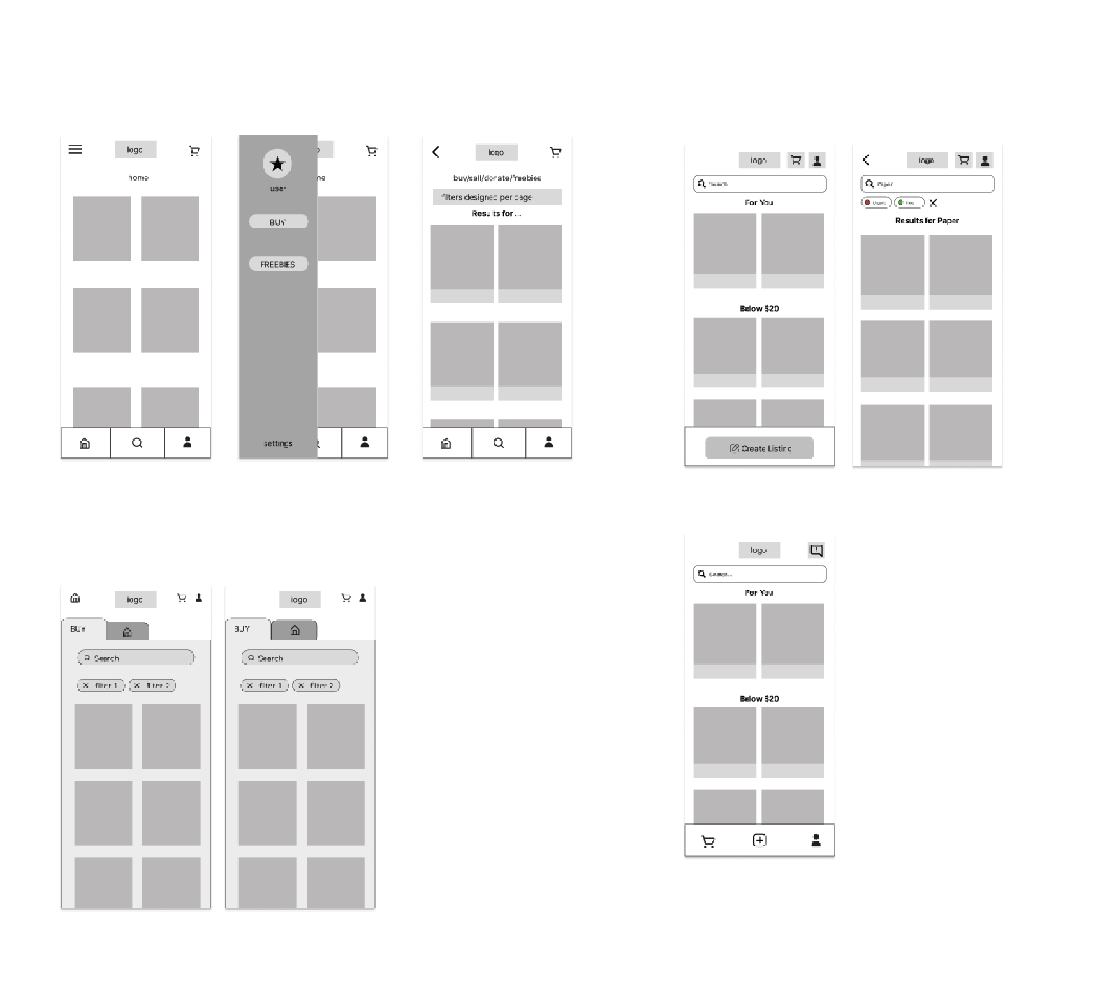
As our targeted audience would be mostly composed of gen-z, we loosely based our UI off of apps that are currently being used frequently, such as Instagram and Facebook so that transitioning to this app would be easy.
CHALLENGE : Deciding the most optimal composition for the home screen
We had 4 different iterations for what our home screen could look like, each having slight difference in navigation.
SOLUTION : Preliminary User Testing
To aid our design choices, we conducted preliminary user tests on our peers, asking them to
examine our wireframes and make suggestions as to what they liked and what they found
uncomfortable or unintuitive.
Some peers said that they wanted icons on the bottom of
the
screens while others did not like this. Some liked having a (navigational) menu tab to keep
things hidden until clicked, but that extra click felt a little uncomfortable to others.
The process of coming up with our branding and design-system felt extremely intuitive to us as design students. We knew we wanted to use contrasting colors to be considerate of students with visual impairments.

We ran our design system through the WCAG Compliance to ensure that it passed, and it did.
USER TESTING
We used our branding to polish our low fidelity prototype and tested it out with potential users.
We received a lot of great criticism, with some key points being:
- Including a search bar when choosing your address instead of having to zoom into your location on the map
- consistency with buttons
- making sure that you can add the price to a new listing.
But, the biggest issue we had through all of this was,
What would you do if you were an alumni?
We had based our security off of .edu emails, which is the way that you would sign up and sign in
to
the app.
But we didn't have a feature in the app that would accommodate for students who had an
email,
but lost it after they graduated.
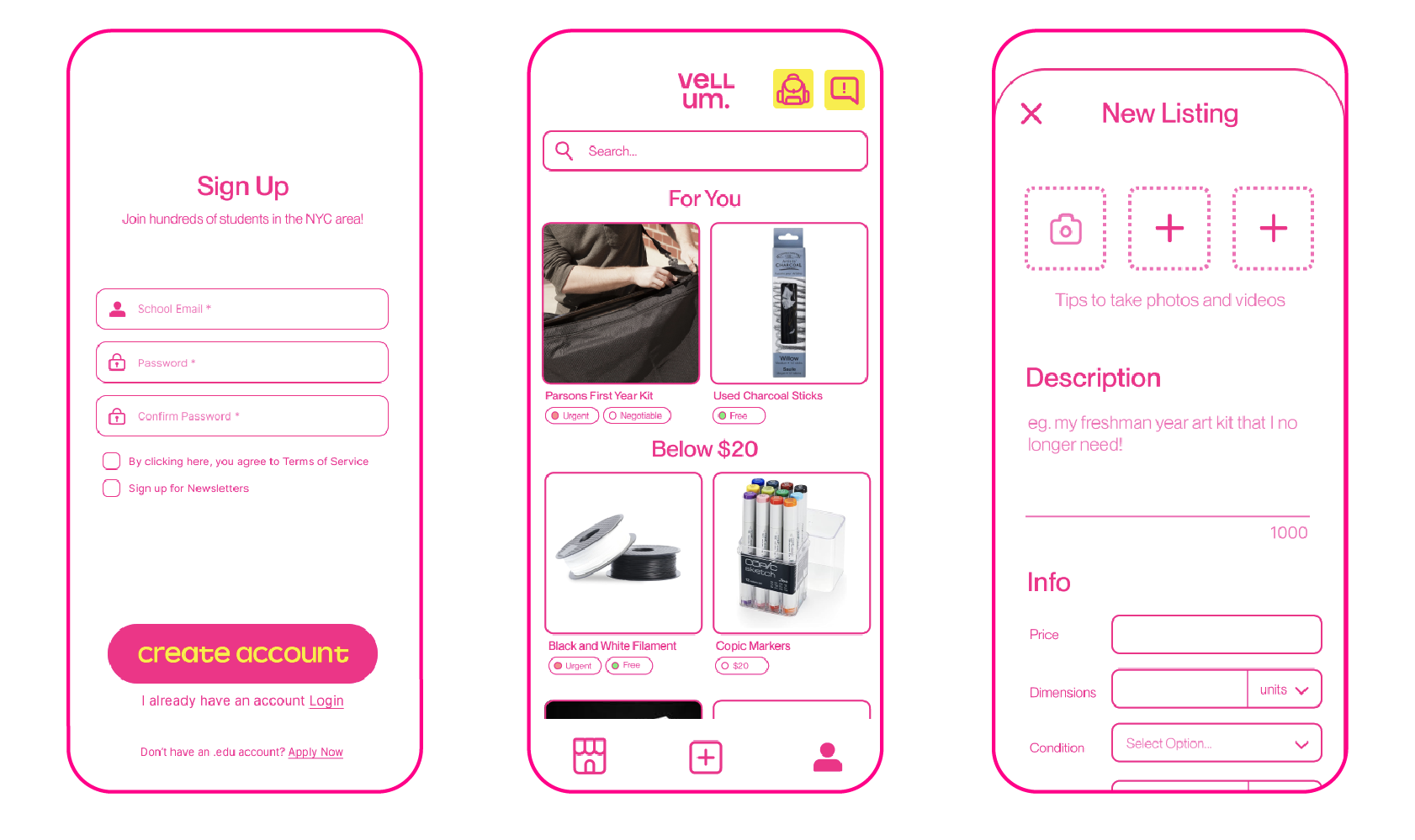
So, we redid our login screen and rearranged it to have an option to apply as a current non-student user like an alumni. Alumni may be a great resource for art supplies, especially those who used to be art students and decided not to go into the field.
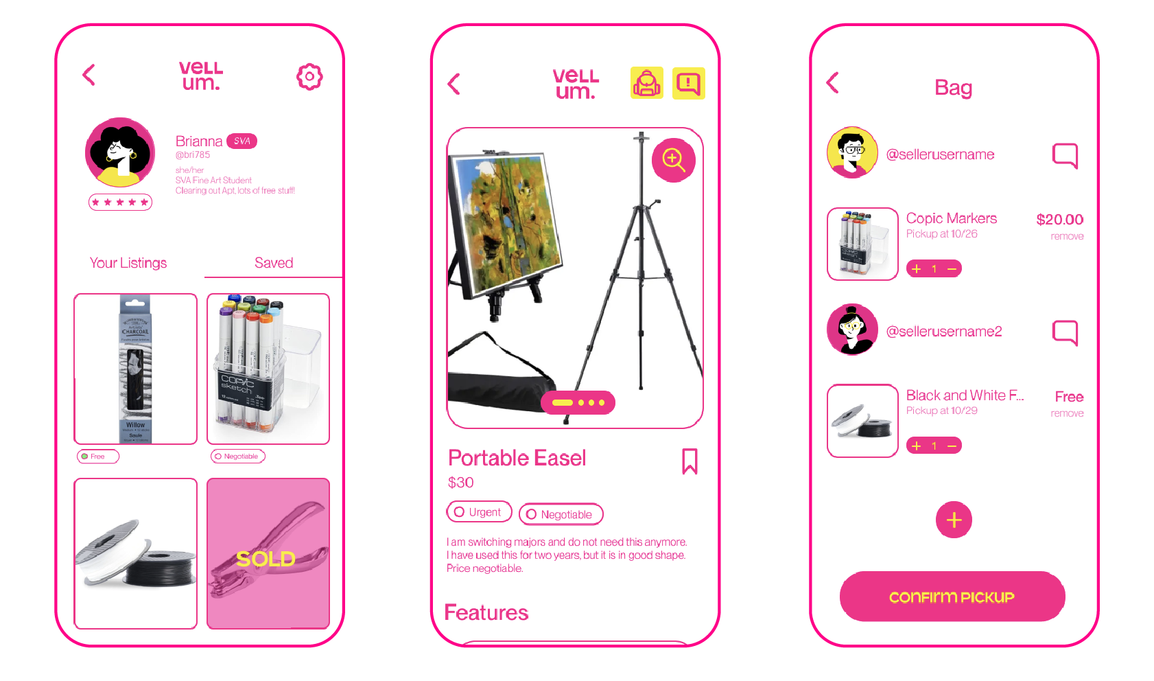
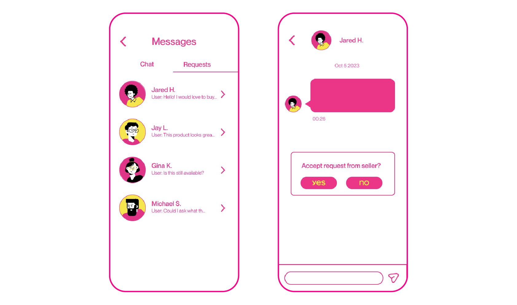
Here are the main screens of our High-Fidelity Prototype.
This was our first official case study, so we learned a lot! Here were our key takeaways:
What if we could redo the process?
Since this was our first Case Study, our initial Information Architecture (which we derived from our competitive market analysis) was extremely comprehensive and time-consuming, when it could have been simplified/generalized.
This would have saved us some time and effort before creating our final app structure.
There have been instances where we would have to backtrack a lot as we cross-referenced only a few aspects of our research to guide our design-decisions.
Organizing all of our data through an affinity map may have helped us utilize all of the data we collected in a holistic manner.